An AR app that delights kids and teaches them nothing has failed at its actual job. Part one covered the theory behind why AR might help, and part two covered how Geo+ was built. This post covers the part that actually matters most: whether it worked, and how the researchers whose study I reviewed for my seminar tried to find out honestly — including the one place their own results asked for caution.
Three hypotheses, stated before the data came in
The evaluation was structured around three explicit, falsifiable expectations, set before the study ran:
- Learning — Geo+ positively impacts learning by helping pupils acquire knowledge.
- Workload — pupils would not perceive much cognitive workload, because the app reads to them as play rather than study.
- Engagement — Geo+ would be engaging specifically because it lets pupils interact with solids in three dimensions.
Stating hypotheses up front, rather than mining results for a story afterward, is what turns "we made something and people liked it" into an actual study. It also means each hypothesis needed its own measurement instrument — you can't answer "was it engaging" with a test score.
Study design: within-subject, real classroom, real teachers
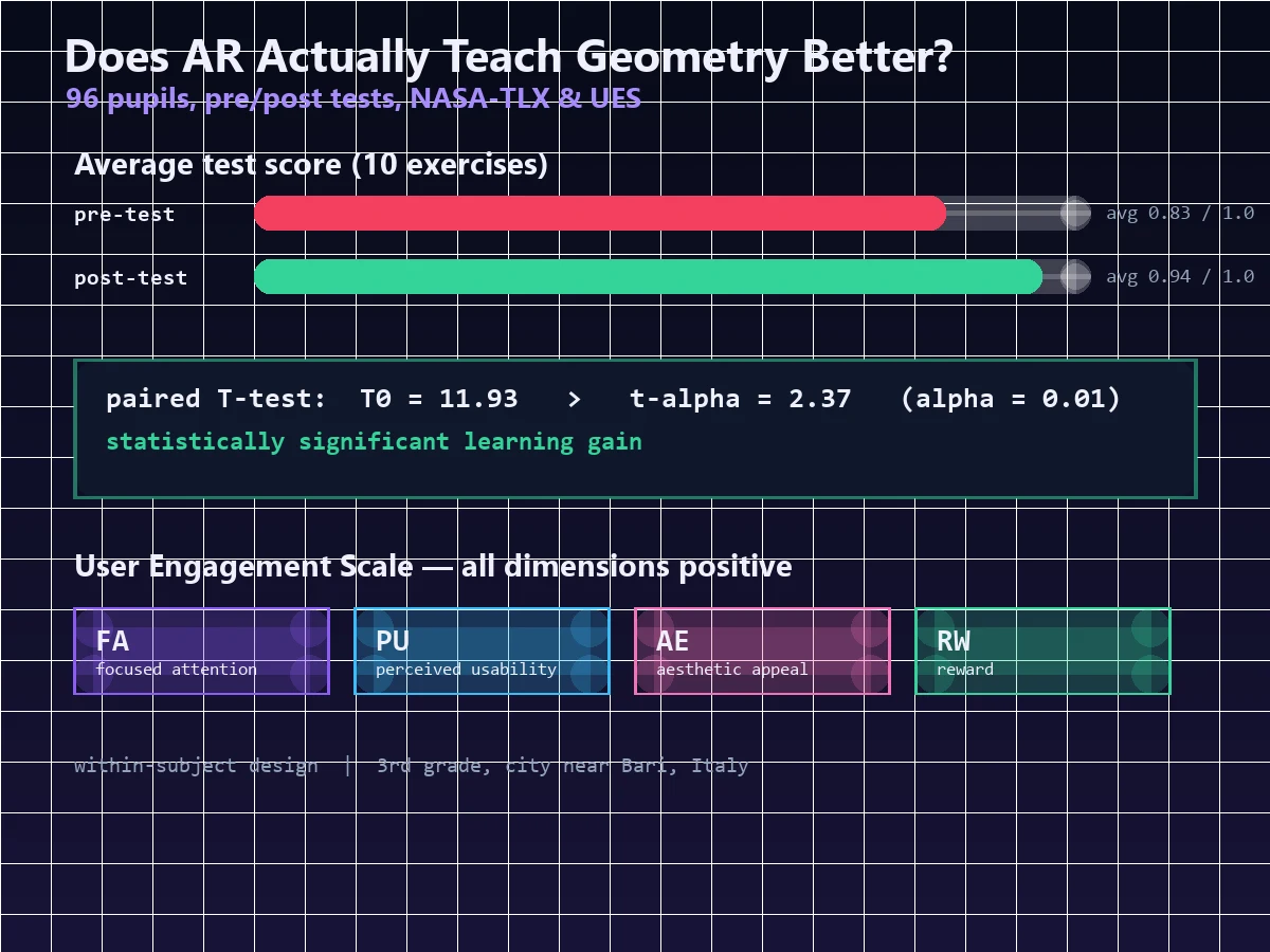
The study involved 96 pupils (51 boys, 45 girls) from the 3rd grade of a primary school near Bari, Italy — all of whom had already covered geometric solids in prior traditional teaching, so the study measured reinforcement of existing knowledge, not first exposure to the topic. The design was within-subject: every pupil experienced both the traditional lesson and the AR session, rather than splitting pupils into an AR-only group and a traditional-only group compared against each other.
The procedure ran in five stages:
- Pre-test — 10 questions/exercises, completed independently and anonymously, roughly 30 minutes.
- Traditional lesson — a PowerPoint-based lesson on the six solids (cube, cone, cylinder, sphere, pyramid, parallelepiped), delivered by the pupils' own teacher — not a researcher, keeping the classroom context intact.
- AR session — pupils split into small groups of 4–5, each with a target marker and a tablet running Geo+, one designated "leader" per group operating the tablet, roughly 30 minutes of interaction.
- Post-test — structured identically to the pre-test, administered a few days later, both tests scored blind by the teacher (1 point per correct answer, out of 10).
- Questionnaires and discussion — an 18-item survey covering workload and engagement, followed by open observation and discussion with the pupils to surface qualitative feedback.
Running the lesson through the pupils' regular teacher, and administering the post-test days later rather than immediately, are both small design choices that matter: they resist the most obvious confound — a novelty spike measured the moment excitement is highest, rather than knowledge that actually stuck.
The learning result: statistically real, not just "kids liked it"
Average scores rose on every one of the ten exercises from pre-test to post-test — a first, purely descriptive signal before any formal test was applied. The real claim rests on a paired T-test on the pre/post differences, with the alternative hypothesis (mean difference greater than zero) tested at α = 0.01. The result: T₀ = 11.93, comfortably clearing the critical value t_α = 2.37 — the null hypothesis was rejected, and the improvement was judged statistically significant, not attributable to chance.
That's the difference between "the numbers went up" and "we have grounds to believe this intervention caused the numbers to go up" — a distinction worth internalizing for any product or feature evaluation, AR or otherwise. A/B test a checkout flow without a significance test behind the "conversion went up" claim, and you're making the same category of unsupported leap.
Workload: satisfaction without the sense of being tested
Perceived cognitive workload was measured with the NASA-TLX, a standard 6-item instrument covering mental demand, physical demand, temporal demand, performance, effort, and frustration, scored on a 10-point scale across all 96 participants. One question — self-rated satisfaction with one's own performance using the app — scored conspicuously higher than the other five dimensions. Read alongside low scores on effort and frustration, the pattern fits the second hypothesis directly: pupils felt capable and satisfied, not strained — the app registered to them as something they were good at, not something demanding they had to push through.
Engagement: all four dimensions, positive
Engagement used the User Engagement Scale (UES) short form, a 12-item instrument on a 5-point Likert scale, summarizing an overall index and breaking out four sub-dimensions: focused attention, perceived usability, aesthetic appeal, and reward. All four came back positive. Combined with the qualitative observation that none of the 96 pupils asked for help during the activity, the usability dimension in particular reads as a real, not merely self-reported, result — a room of 8-year-olds not needing to ask an adult how to work the tablet is a stronger usability signal than any survey question.
The honest caveat: a ceiling effect
Here's the part worth taking as seriously as the positive headline numbers. The report explicitly flags a ceiling effect in the learning-gain analysis. Several exercises had pre-test averages already close to the maximum score — pupils, having already covered the material once traditionally, were getting many questions right before ever touching the AR app. When a starting score is already near the top of its scale, there simply isn't much room left to demonstrate further "gain," no matter how effective the intervention actually is — and the measured effect on those specific exercises understates whatever the app's true impact was.
Reporting a limitation that weakens your own headline number, rather than quietly omitting it, is exactly what separates a study worth trusting from a marketing deck. It's also a reusable diagnostic: if you ever evaluate a feature against a metric that's already near-saturated for a chunk of your users, expect measured "improvement" to understate real impact — and say so, not bury it.
What this evaluation pattern is good for beyond geometry
Strip away the pyramids and primary-school context, and the underlying method generalizes cleanly to any interactive product: an objective outcome measure (the pre/post test), a subjective effort measure (NASA-TLX), and a subjective engagement measure (UES) together triangulate on "did it work" from three independent angles that rarely all agree by accident. That triad is exactly the shape of question a UX researcher asks about an onboarding flow, an admin dashboard redesign, or any feature where "users seemed to like it" isn't actually the question that matters — whether it produced the outcome it was built for is.
Common pitfalls
- Reporting engagement as if it proves learning. They're different hypotheses requiring different instruments — Geo+'s study measured both precisely because one doesn't imply the other.
- Skipping significance testing. Pre/post averages going up is a descriptive fact; the paired T-test is what turns it into a defensible causal claim at a stated confidence level.
- Testing immediately after the novelty peak. A post-test given the same day risks measuring excitement, not retention — the days-later gap here was a deliberate design choice.
- Burying a ceiling effect instead of reporting it. A limitation that complicates your best number is exactly the one worth stating plainly.
- Using a single instrument to answer three different questions. Learning, workload, and engagement each got their own purpose-built measurement tool rather than being inferred from one survey.
FAQ
Did you run this study yourself, with real students?
Is a within-subject design better than comparing separate AR and non-AR groups?
What would make this evaluation even stronger?
Does a ceiling effect mean the results are invalid?
Interested in UX research, EdTech, or a full-stack build in Dubai, UAE? Get in touch.

About the author
Ashiq S is a Full Stack Developer based in Dubai, working with Laravel, PHP, WordPress, WooCommerce, APIs, Docker and Linux. See his projects and experience. Hiring? See freelance Laravel development or full-stack roles in the UAE.